Nuts-and-bolts of web accessibility
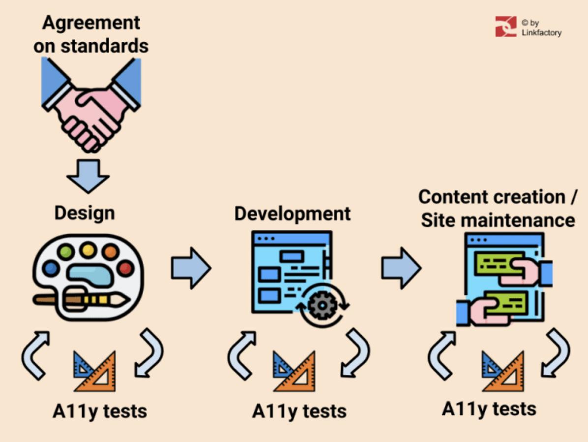
In our first article about web accessibility (sometimes also referenced as “a11y”), we discussed the topic from the manager’s or CEO’s point of view. Now, let's take a closer look at more practical technical aspects. We will use the previously described process of going through the project with accessibility in mind as a guide.
We will highlight what is important on every stage of the project, especially the following:
- Graphic design
- Front-end development
- Content creation and maintenance
Tests and analyses of web accessibility should be conducted at all of the main stages (design, development and content creation). Participation of testers with real disabilities is highly encouraged, especially at the second stage.
Here we are focusing mainly on people with sight impairments but accessibility refers to inclusion of all kinds of disabilities - also cognitive, motor or aural.
Agreement on standards
If you are building a website for a public institution within the EU or you wish to keep accessibility standards that are set by the european law, then you should stick to doing so according to WCAG (Web Content Accessibility Guidelines). In version 2.1 and on the level AA (as in 2020). Details for Danish law requirements can be found here. Here is the full description of the EU standard (“Accessibility requirements for ICT products and services”).
It is worth noting that public institutions’ websites in Denmark are required to have a special document made - an Accessibility Statement. It should be created according to this information.
So before designers and developers can start their job, you need to have an agreement stating that you will build your site according to certain standards. The whole team has to be informed about it.
Graphic design
Design is a crucial element of every website - this is why it should be created with accessibility in mind from the very beginning. Here, the focus should be on proper contrast and typography, for example text spacing and font size. Also color (or the look) of links is important. Minimum contrast depends not only on the accessibility level (there are differences between AA and AAA), but also on the font size.
The contrast is measured by ratio between the background and the color of the text. The biggest contrast is of course between black and white: it's 27:1 to be precise, and the lowest contrast is between the same colors, it's 1:1. Other options are between. According to the survey made in 2020 (The WebAIM Million) over 85% of analysed websites have a too low contrast of text so this is unfortunately a very common problem. It may be because design is often treated as an art-work so people do not like to interfere with the designer's choices. And many art trends in web design do not support accessibility. A good example of such a trend is using light-gray text.
Therefore, it is even more important to make the designer aware of the accessibility requirements before he or she starts the designing process. If you wish to learn more about it, I recommend reading Web Accessibility for Designers collection created by WebAIM.
Tools and techniques for design testing
You can use any kind of eyedropper tool to learn what colors are used in the design, unless of course they are directly provided by the designer. The basic tool for dealing with color data is a contrast checker. A good example of such a tool is the WebAim contrast checker, where you can type in a hex triplet of the color. Text spacing can be tested with any ruler tool, usually available in graphical applications or browsers (as an extension or in DevTools). The look of the links should be checked visually by a tester.
Front-end development
When graphic design is ready, then usually developers, especially front-end developers can jump into the project. At this stage, there are a few suggestions on what should be their concern in terms of accessibility. In general, elements and widgets are made according to WCAG and if the content is dynamic and rich, then also the WAI-ARIA should be taken under consideration. It is important to be aware that while using Aria attributes as “bad aria is worse than no aria”. In most cases, proper semantic HTML5 code may be enough. On the other hand, there are plenty of nice examples, especially on the ARIA Design Pattern Examples website. Now, let's look at common traps.
Language
Many times when a CMS or some standard templates are used, then English language appears in the main HTML element by default and almost no accessibility test tool raises a flag! But when the very page content is written in another language, like Danish, then a screen-reader will try to read it using English rules of pronunciation. And of course, it can be a challenge for users to understand it properly. The proper way would be to use a lang attribute, like this: <html lang = ”da”>or <html lang = ”da-DK”> .
Onfocus styling
It may still be practiced to remove the default dotted frame when the element is focused or clicked, but it can create problems for those who are using a keyboard for navigation. Just try to navigate with a tab key on any page and imagine (or it may be true) that you do not see which one element is currently active. The solution is to create some JS tricks like toggling some additional class for body element when someone uses mouse instead of keyboard. Then you can easily disable outline for links clicked with a mouse pointer.
Toggled or hidden elements
Aria may be helpful when a part of the content is initially hidden and can be opened by clicking on some list items, headers or icons. For example accordions or submenus. There is almost no way to guess with a screen-reader that certain elements are opening other elements. Here aria-expanded attributes or other techniques can be used.
Do not overuse "assertive" settings
To focus the user’s attention on some immediate message, aria-live attribute may be used. It is important not to overuse it since it might be annoying when a user is trying to read other parts of the page. Read more about Live regions.
Back-end development
In this article, I assume that the HTML + CSS + JS are managed entirely by front-end developers. Otherwise, the backend developers need to take care of accessibility just as much as they change or develop any HTML code.
Tools and techniques for front-end accessibility testing
Since at the time of development the site may not be published and its code is being changed often, it is not a time for using bots that automatically check accessibility (like SiteImprove). A good choice are browser extensions. Here are a few examples:
Extensions for Chrome
- Wave
- Siteimprove
- Accessibility Insights for Web
Extensions for FireFox
- Totally Automated Accessibility Scanner
- Wave
FireFox and Chrome also have good tools inside DevTools.
Keyboard navigation
At this stage, it is good to use keyboard navigation tests, simply by using a keyboard instead of a mouse or a touchpad. The simplest test is to use tab and shift + tab to jump throughout focusable elements. Some widgets should support more shortcut keys, like use of the up and down arrows on a dropdown option list. For more details look into complementary documentation for WAI-Aria, called WAI-Aria practices, where you can find design patterns and keyboard support for every example (search for the section “Keyboard Interaction”).
Screen readers
It is not easy to use a screen reader as a person without sight issues, but it is possible after some practice. You just need to get used to synthesized digital voice and learn a few keyboard shortcuts, different for every software. Try to imagine that you can not see (or switch off the screen) and "hear" different parts of the page, like navigation, content and widgets. Read the WebAIM article that tells more on this. What screen reader should be used for testing? Well, look at usage trends (survey taken in 2019):
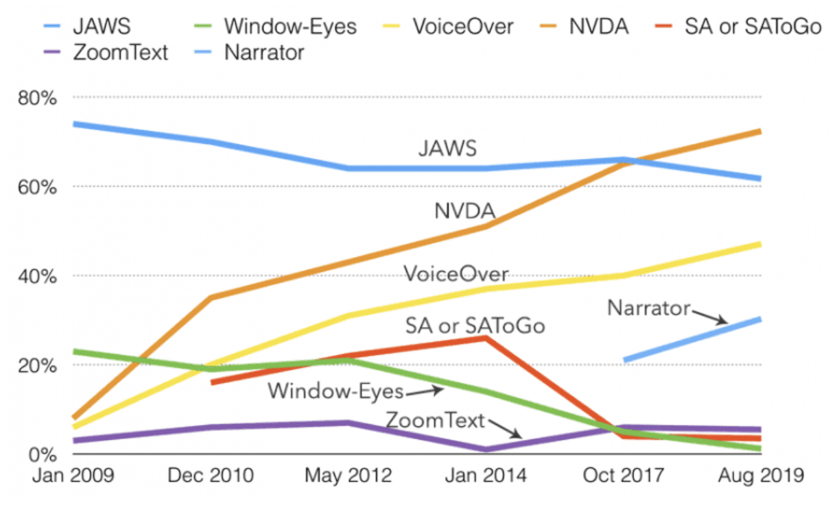
It seems that currently the most popular screen reader is NVDA - an open source reader for Windows but Narrator built by Microsoft for Windows 10 and VoiceOver built for MacOS are also trending. JAWS is also popular (it was purchased by Danish government years ago so there must still be plenty of users in Denmark). The quick test solution is also to use ChromeVox Chrome extension, but it is not very popular among impaired users since it only reads webpages. Since it doesn’t work for the whole operating system, therefore its use is limited for them.
Participation of testers with disabilities
To maximize the quality of the final result, some real users with disabilities should be invited to make manual tests. The procedure should be similar to software manual tests, so test cases and scenarios should be prepared. Then simply provide test tasks for example “Use search function and try to find page XYZ” or “Try to find last company's job offers” and ask to report all issues and challenges. After tests, all issues should be fixed and if there is a need some tests should be repeated.
Creation of accessible content
This part of the article is dedicated mainly for editors and webmasters - the people who are creating, editing and maintaining the very content. Let’s analyse what is vital on this stage.
Structure of the document
It is important to use proper hierarchy of headings, like H1, H2 etc. Document should have one H1 header, which works similar to a book title, and other headers work as chapters and subchapter titles. Preferable H2 and H3 etc. so that the hierarchy is preserved. So for example do not put H3 after H1, skipping H2. Then, normal text should be included in paragraphs.
Semantic HTML
In general, HTML elements should be used according to their purpose and vice versa. So if you need to put any kind of distinguished information, like definition, citation etc. you should use appropriate elements that will add not only proper visual shape, as it is often the primary concern, but also proper meaning. Screen readers will inform users about the type of the content. Let's look closer at some of them.
Images
The most important for impaired users is to know what is depicted on the used image file. Alternative information that will shortly inform about image content is usually sufficient, for example “Picture of Lady Gaga with a tennis racket”. It is nice to write “Picture of etc.” instead of just “Lady Gaga with a tennis racket”. But if you do not add any alternative text then the screen reader will read the whole name of a file. That can be terrible in some content management systems, cause when resizing picture file names can be changed to something like “9h2sa076d7_small.jpg”, just imagine hearing something like this! In case the picture has only decorative meaning then just put an empty alt attribute so it can be ignored.
Sometimes a real nightmare is undescribed infographics, since users can be curious about what is on them. So a longer description or even alternative page can be provided for better understanding.
Tables
Tables that are often copied and pasted from MS Word or other text processors may be hard to understand. The best solution would be the use of a full range of table tags, like thead, tbody, th, tr, td, tfoot and caption. For example, the use of th instead of td in the table header row will cause the reading of the column name every time before reading the very cell content. It helps to understand it, especially when the table is long.
Forms
Form element also requires more attention. Fields should receive proper labeling, which means that the labels should be descriptive and the attribute for should be linked with id of related field. The best situation is to use native HTML form elements over visually attractive form widgets, since the latter can cause accessibility issues.
How to test content's accessibility?
You can basically use the same tools and techniques that were discussed above for the front-end development. In addition, since usually the site is already published, you can use special bots that can point to the potential accessibility issues on your page. For example SiteImprove Automated Accessibility Checks. There are also online tools such as https://wave.webaim.org/ (actually the same results can be achieved by using Wave browser extension).
Other tools:
https://tenon.io
https://github.com/liip/TheA11yMachine
https://github.com/paypal/AATT
Summary
So is making a website accessible a challenge? Yes, maybe a bit… we agree. But we cross our fingers for your efforts! It is an important work after all. If you need any assistance with the web accessibility, you can read our offer and contact us.